Starbucks
Starbucks TW Redesign Concept for iOS & Android
Starbucks TW Redesign Concept for iOS & Android
Starbucks app redesign concept tries to solve the issues about interaction and visual design of current app. The information architecture is reorganized and material design and outline icons are adopted to make app more modern and friendly.
• • • • • •
In 2015, I used the Starbuck TW APP and the experience was really terrible, so I tried to redesign it then. I just redesigned this work during my free time. That's why it was postponed for a long time :P. Finally, it was finished!
However, I am still keep thinking about the redesign may have some flaws. Card, for example, has too many button in that screen and add a new card may be not often used. So the better way to tackle it is moving some rarely-used actions to overflow icon in action bar.
Nov 2015 - Mar 2016
Interaction Design
Visual Design
The visual style is old-fashioned and not updated with time.
視覺風格設計老派,長久未更新。
The screens are filled up with lots of colored blocks with different sizes.
畫面充斥莫名其妙大小不一的色塊。
All icons have blurred edges. No pixel perfection.
icon 未注重 pixel,都有鋸齒邊緣。
The font size, line height and letter spacing are not considered well.
文字間距、大小,皆未詳細考慮。
The information structure is messy because it is not organized and sorted by importance and relevance.
架構鬆散混亂,未依相關性和重要性分類排序。
Information hierarchy has too many levels that cause the issues about information accessibility and findability.
縱向階層結構過深,相關資訊取得不易。
After reviewing the structure of original app, information organizing and labeling are modified to optimize navigation. Information is organized by relevance and importance in flatter hierarchies in new design.
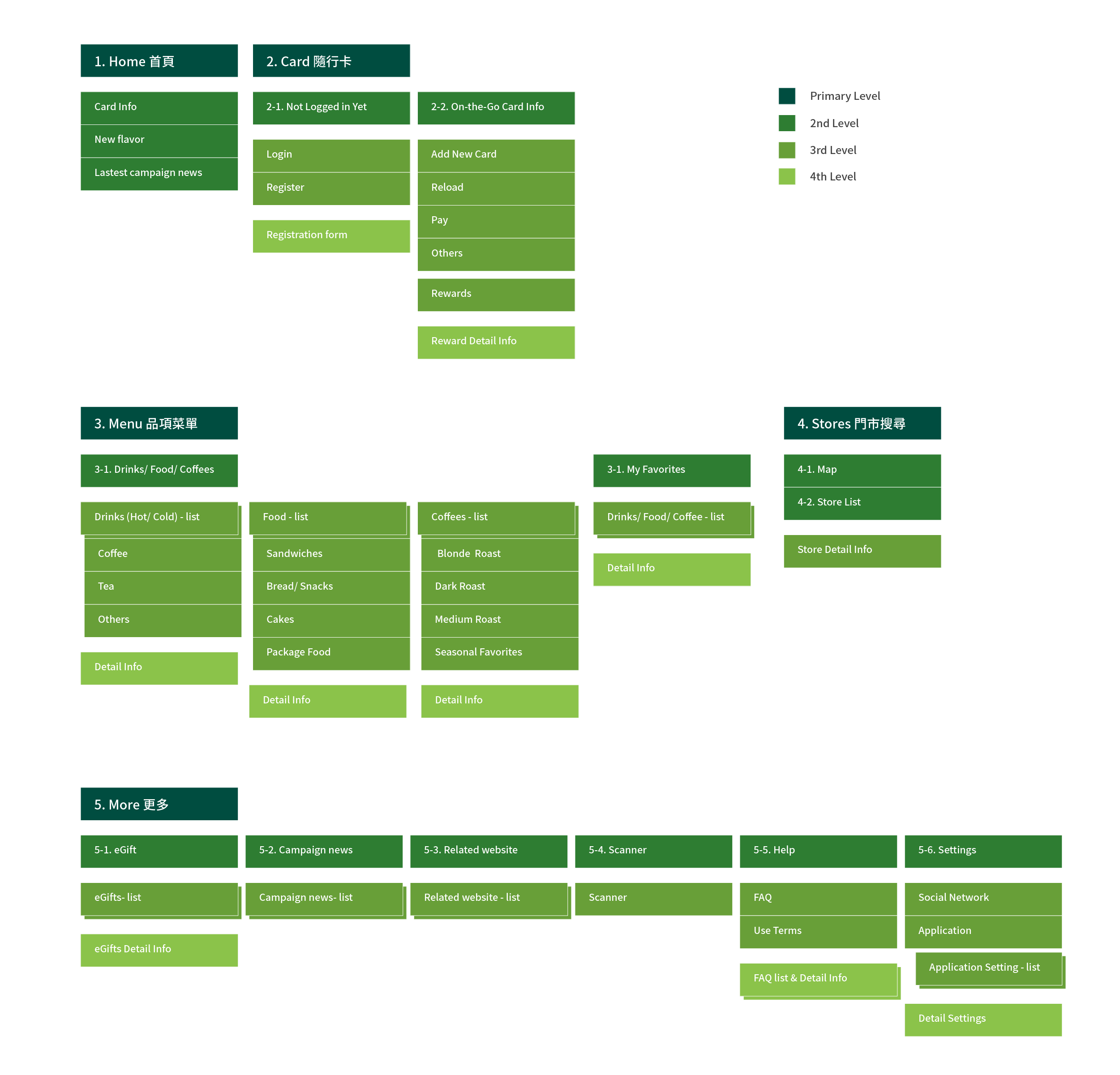
Consolidating ideation and visualizing concepts via high-fidelity wireframes. A part of the wireframes of iOS key screens and Android flow design are shown below.
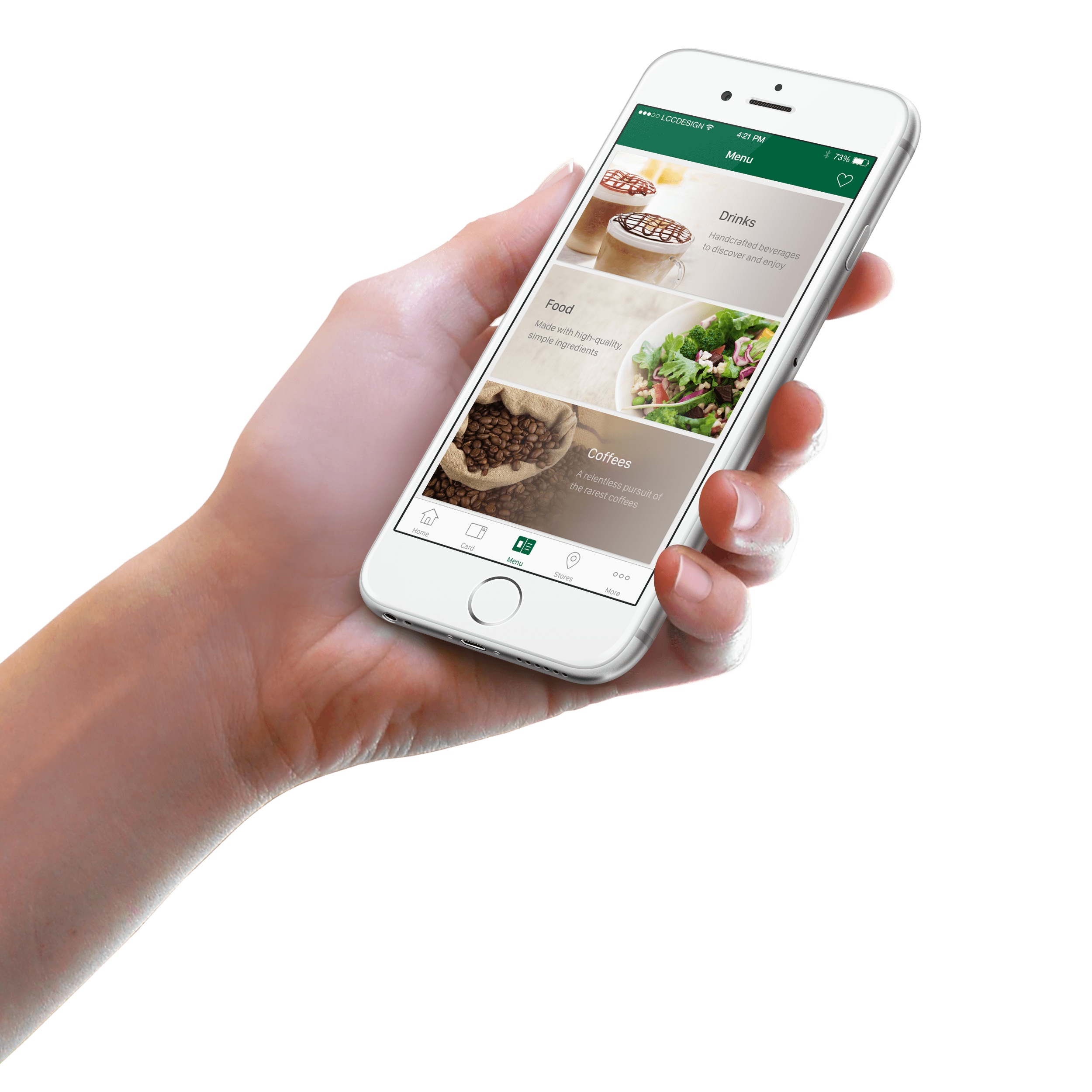
Outline icons, which are both modern and friendly, work perfectly with minimal design and are a great way of bringing apps up to date easily.
Looking past the UI to the app’s core functionality and affirm its relevance. Using the themes of iOS to inform the design of the UI and the user experience.
Applying Material Design which creates a visual language for users that synthesizes the classic principles of good design with the innovation and possibility of technology and science.


