Gamer Box
Social Network for Gamers
Social Network for Gamers
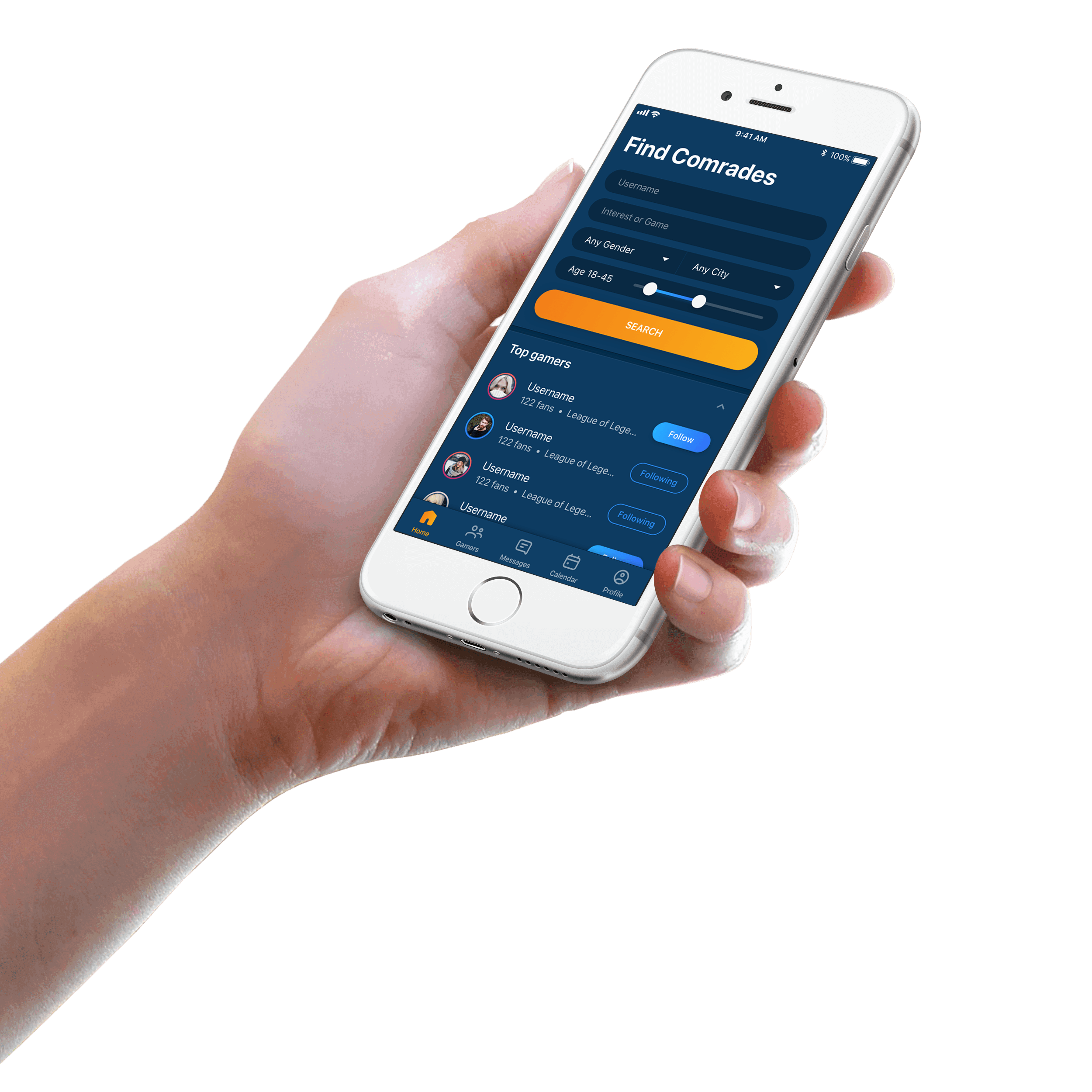
Gamer Box is a social media app for gamers to find others with the same interests to invite them to play games together.
You can set up conditions, like age, location, gender and game, to search and filter gamers that you want to play games with. You can send invitation to friends or other gamers easily by a single tap or chat with them on the chat room. You also can update the lastest games on your profile to let other gamers find you and further make a friend with you.
• • • • • •
My client had first version of Android app and they would release new version with new features, like creating events from calendar and writing blog articles, for not only Android but also iOS. In the new version, users can pay to upgrade their account to access some advanced services. I reviewed the first version of Android app and revised usability issues on newly designed app.
After reviewing the structure of original app, information organizing and labeling are modified to optimize navigation. Search function as an essential feature is moved to home screen and calendar is moved from action bar to navigation bar.
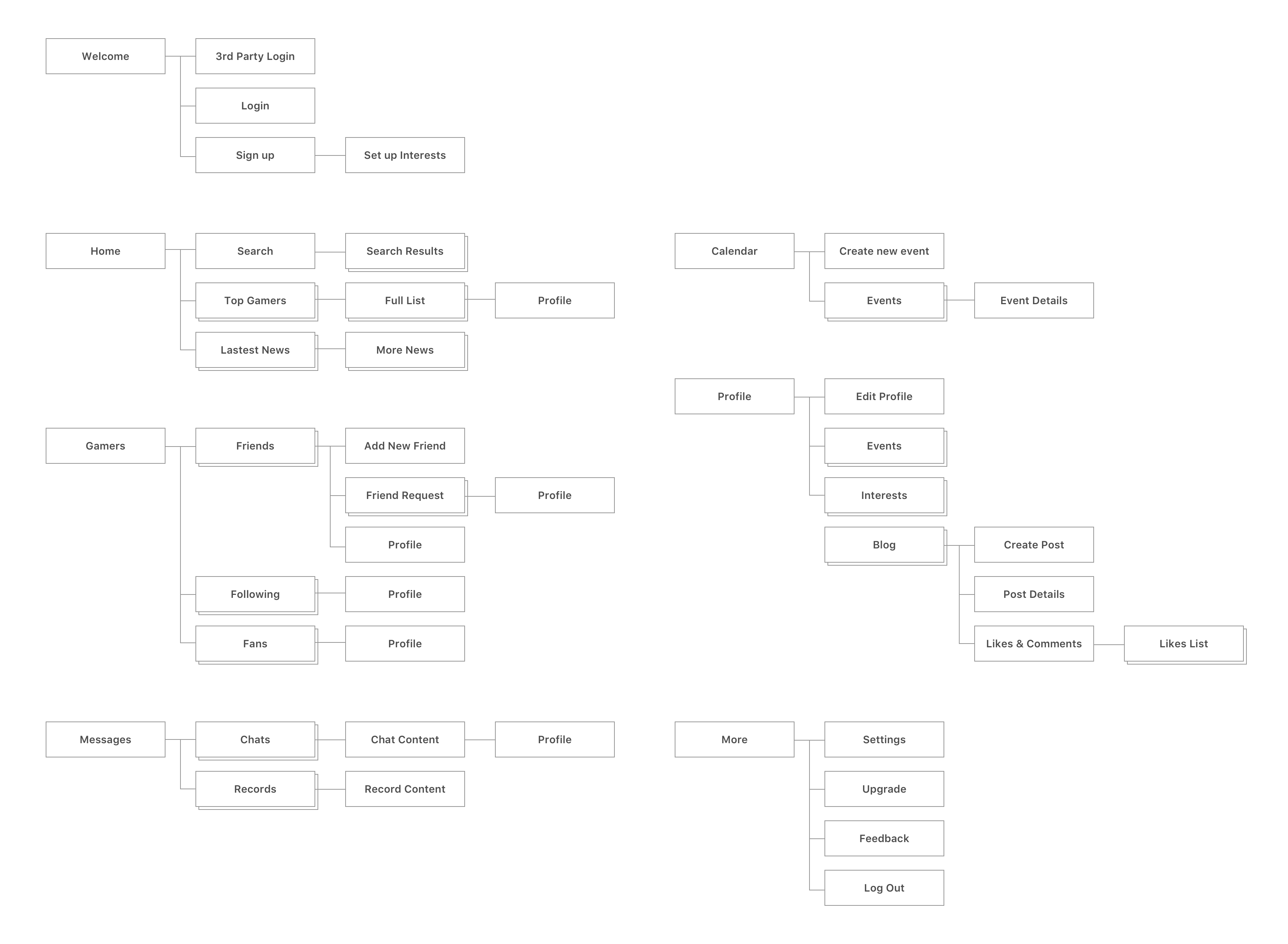
For Consolidating ideation and visualizing concepts, Android high-fidelity wireframes and flow design are produced as below.
Design is an iterative process. Sometimes my client and I have different opinions and it is hard to get balanced. I always tried my best to convince my client that my thoughts are better choices, but I also have flexibility to change my design considering the startup's limited resource. And also, we lock evidence to proof which design is actually better. So we tried to release MVP as soon as possible and then to see the results to modify after receiving feedback from users.
I replaced the spinner for selecting age by a slider because 1) it was faster to select an rough age range and 2) it would save more space, especially this feature was moved to Home which has other information to show. In the end, my client took this suggestion.
I also tried to combine 2 search text fields, Username and Interest/Game name, to a sigle search text field becasue I thought 1) users may rarely set up 2 conditions in the same time to search and 2) One single search bar is simpler, so users do not need to think about which one they should enter the search keywords. But I failed to convince my client; they thought username may have the same name with a game name. I thought this was an extreme case and it could not cause any serious damage. In the end, we decided to keep 2 text fields and see results from data for later iteration.
Client's original design on search result is that if users cannot not find the gamers they are interested, they can tap a search icon again to generate new list. I provided another solution which users do not need to search at all. A random list, like recommended potential friends or auto-matched friends, which lists the gamers have the same interests with users, can be provided at Home screen below/above top 10 gamers. My client said it was good idea and would take it as the feature for the next version. And originally I also proposed we can use lazy loading for search results. For this version, we still keep orginal design concept, but I let users can see their search conditions on the screen and modify them immediately rather than tapping an edit icon to go back.
I segguested to add user thumbnail to let users understand whom they talk to more easily. The action bar would be the perfect place for the thumbnail becasue it would waste some space for showing more texts if the thumbnails are put in chat content area. But clients said they may have a plan for one-to-many rather one-to-one chats in the future, so in the end, we decided the thumbnails were shown in chat content area.
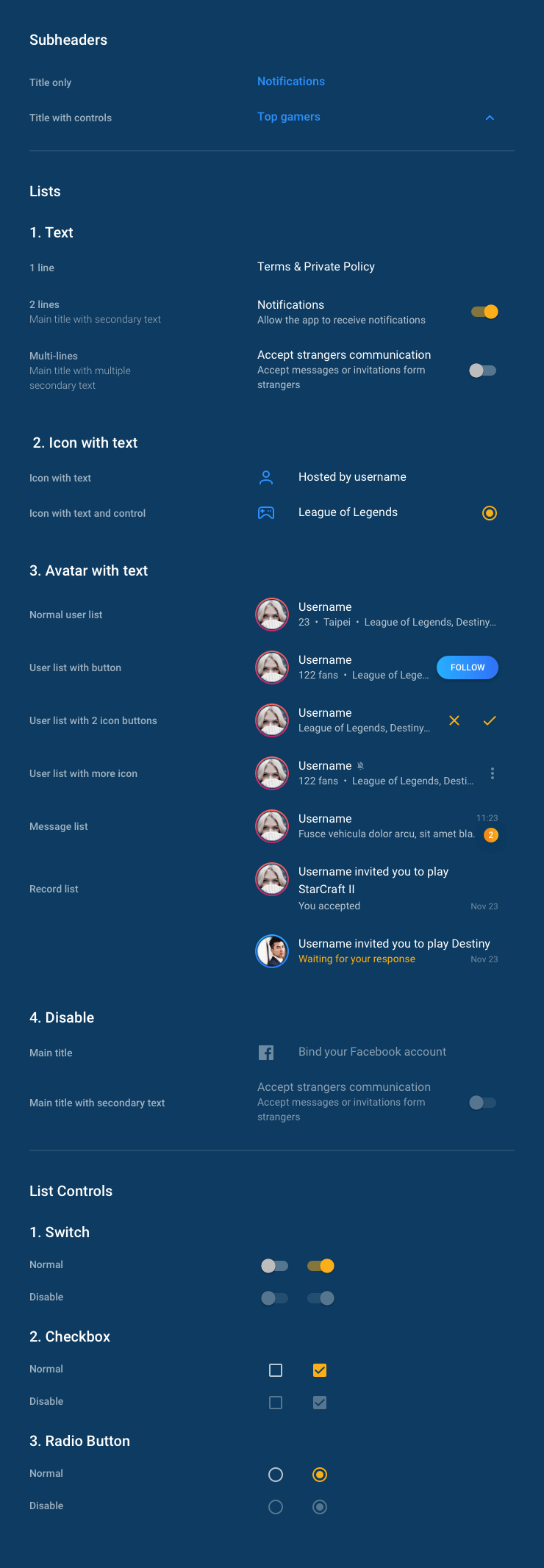
Outline icons, which are both modern and friendly, work perfectly with minimal design and are a great way of bringing apps up to date easily.
Style guidelines are generated for design language consistency and better implementation. Click Here to see the guideline in an interactive HTML page.
Looking past the UI to the app’s core functionality and affirm its relevance. Using the themes of iOS to inform the design of the UI and the user experience.
Applying Material Design which creates a visual language for users that synthesizes the classic principles of good design with the innovation and possibility of technology and science.


